


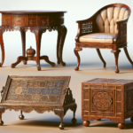
Iconic Designs: The Furniture Pieces That Changed Interiors
July 2, 2024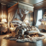
Haute Hibernation: Designing Luxurious Sleeping Sanctuaries
July 9, 2024
-
Table of Contents
- Introduction
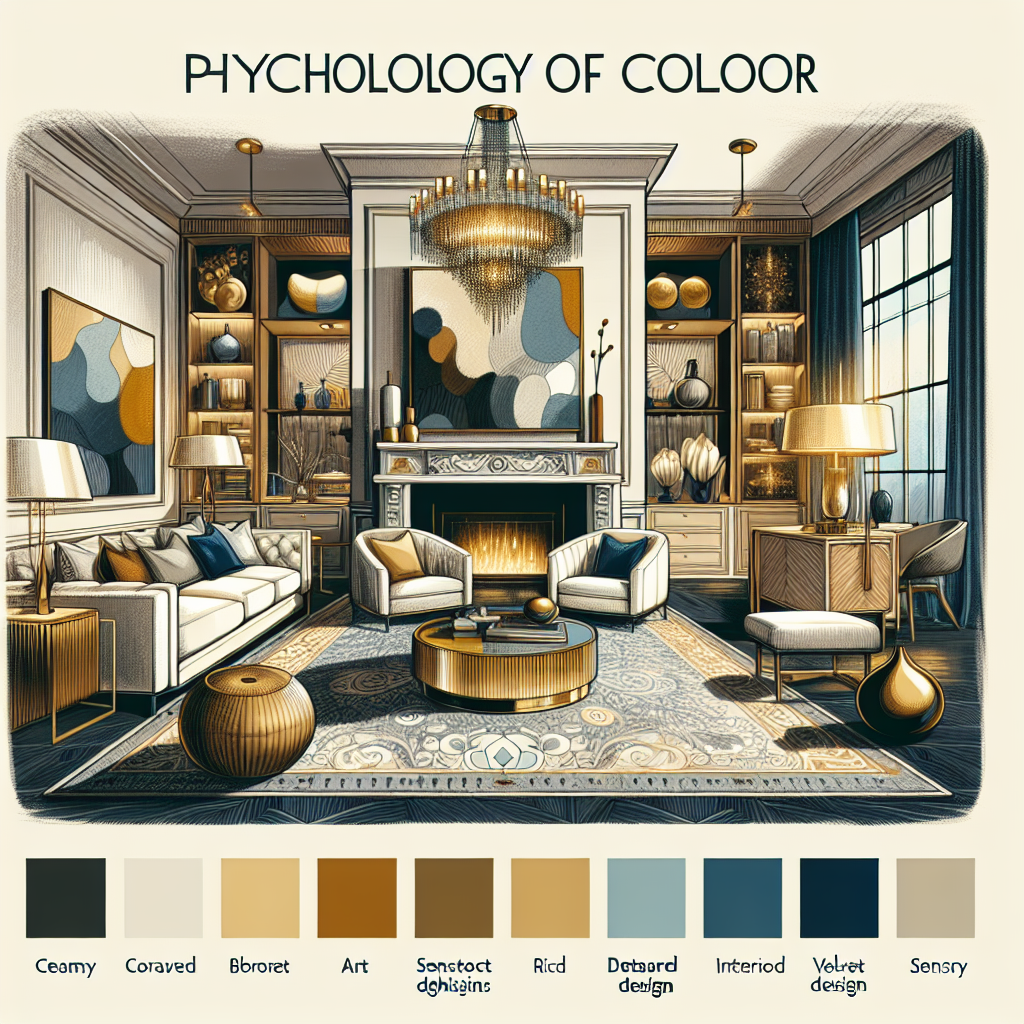
- The Impact of Color Psychology on Luxury Interior Design
- How Chromo-Luxury Enhances the Perception of Opulence
- The Role of Color in Creating Exclusive Ambiances
- Using Chromo-Luxury to Elevate Brand Identity in High-End Spaces
- The Science Behind Color Choices in Upscale Environments
- Conclusion
Introduction
“Chromo-Luxury: The Psychology of Color in Upscale Spaces” delves into the intricate relationship between color psychology and luxury interior design. This exploration highlights how color choices in high-end environments influence perceptions of opulence, comfort, and exclusivity. By examining the emotional and psychological impacts of various hues, the book provides insights into how designers and architects can strategically use color to enhance the allure and sophistication of upscale spaces. Through a blend of scientific research and practical applications, “Chromo-Luxury” offers a comprehensive guide for creating atmospheres that resonate with elegance and prestige.
The Impact of Color Psychology on Luxury Interior Design
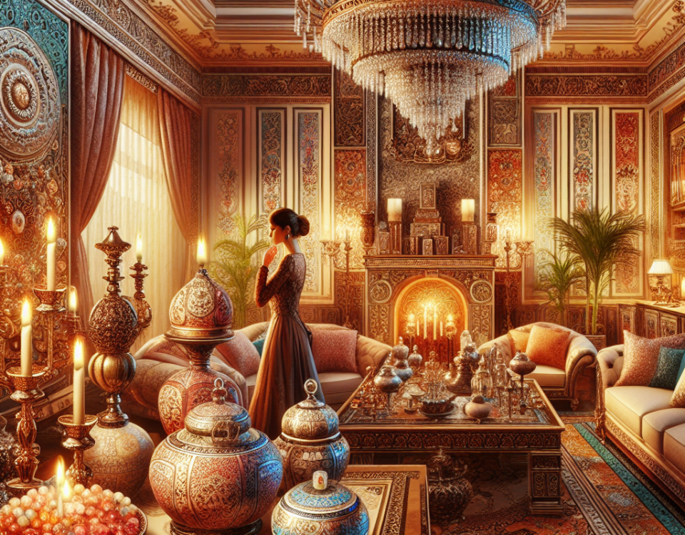
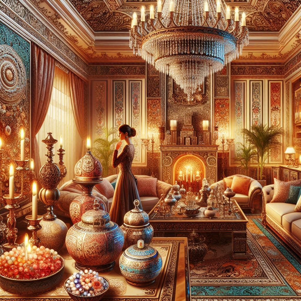
When you step into a luxury space, whether it’s a high-end hotel lobby or an upscale boutique, there’s an immediate sense of elegance and sophistication that envelops you. While the plush furnishings and exquisite decor play a significant role, the colors used in these spaces are often the unsung heroes of the ambiance. The psychology of color in luxury interior design is a fascinating subject, as it delves into how different hues can evoke emotions, influence perceptions, and ultimately enhance the overall experience of a space.
To begin with, color psychology is the study of how colors affect human behavior and emotions. In the realm of luxury design, this concept is taken to a whole new level. Designers meticulously select color palettes that not only align with the brand’s identity but also create a specific mood or atmosphere. For instance, deep, rich colors like royal blue or emerald green are often associated with opulence and sophistication. These shades can make a space feel more intimate and exclusive, inviting guests to linger and enjoy their surroundings.
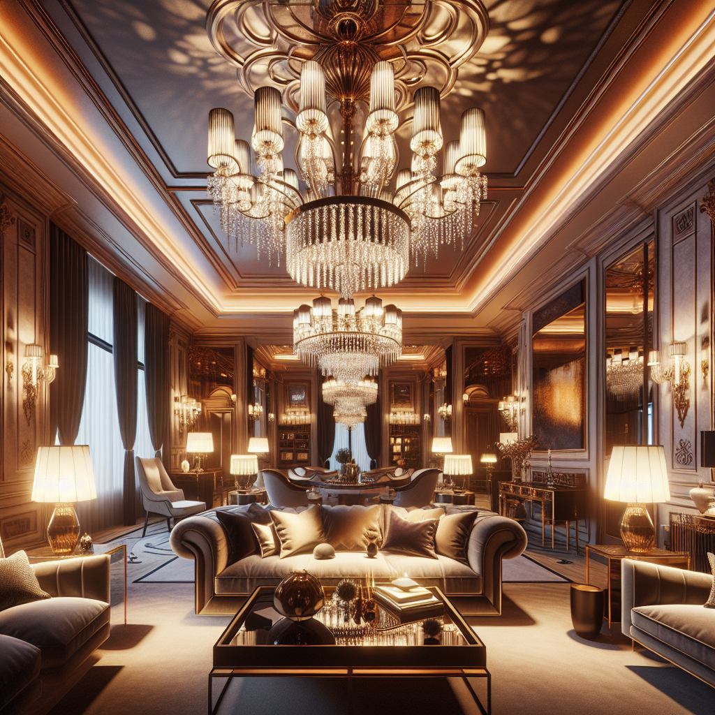
Moreover, the use of color in luxury spaces is not just about aesthetics; it’s about creating an experience. Take, for example, the use of gold and metallic accents. These colors are synonymous with wealth and grandeur, and when used strategically, they can add a touch of glamour and elegance to any room. A gold-accented chandelier or a metallic-finished coffee table can serve as a focal point, drawing the eye and adding a layer of visual interest.
Transitioning from the bold to the subtle, neutral tones also play a crucial role in luxury interior design. Shades like taupe, beige, and soft gray are often used as a backdrop to highlight more vibrant colors or to create a serene and calming environment. These colors are versatile and timeless, providing a sense of balance and harmony. They allow other design elements, such as artwork or statement furniture pieces, to shine without overwhelming the space.
In addition to the colors themselves, the way they are combined and contrasted can significantly impact the perception of a luxury space. A well-thought-out color scheme can create a sense of cohesion and flow, guiding the eye from one area to another. For example, a monochromatic palette with varying shades of the same color can create a sophisticated and cohesive look, while complementary colors can add a dynamic and energetic feel.
Furthermore, the psychology of color in luxury spaces extends beyond the visual to engage other senses. For instance, a room bathed in warm, earthy tones might be paired with soft, ambient lighting and plush textures to create a cozy and inviting atmosphere. On the other hand, a space dominated by cool blues and whites might be designed to feel fresh and invigorating, with sleek, modern furnishings and crisp lines.
Ultimately, the impact of color psychology on luxury interior design is profound. It goes beyond mere decoration to influence how we feel and interact with a space. By understanding the emotional and psychological effects of different colors, designers can craft environments that not only look stunning but also resonate on a deeper level with those who experience them. So, the next time you find yourself in a luxurious setting, take a moment to appreciate the colors around you and consider how they contribute to the overall ambiance. You might just see the space in a whole new light.
How Chromo-Luxury Enhances the Perception of Opulence
When you step into a luxurious space, whether it’s a high-end hotel lobby or an exclusive boutique, there’s an immediate sense of opulence that envelops you. While the plush furnishings and exquisite decor play a significant role, the subtle yet powerful influence of color is often the unsung hero in creating this atmosphere. The concept of chromo-luxury, which refers to the strategic use of color to enhance the perception of luxury, is a fascinating blend of psychology and design that can transform any space into a haven of elegance.
To begin with, color has a profound impact on our emotions and perceptions. It’s no secret that certain hues can evoke specific feelings; for instance, blue often brings about a sense of calm, while red can ignite passion and energy. In upscale spaces, designers harness this psychological power to craft environments that not only look luxurious but also feel indulgent. By carefully selecting and combining colors, they can create a mood that resonates with the essence of luxury, making guests feel pampered and special.
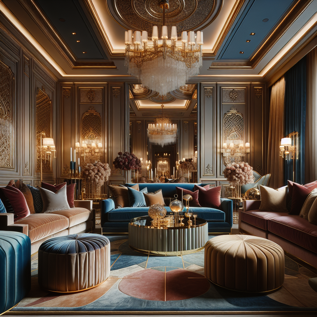
One of the key elements of chromo-luxury is the use of rich, deep colors that exude sophistication. Think of the opulent burgundies, royal blues, and emerald greens that often adorn the walls and furnishings of high-end spaces. These colors are not only visually striking but also carry connotations of wealth and exclusivity. When paired with materials like velvet or silk, they create a tactile experience that further enhances the perception of luxury. Moreover, these colors can be used to highlight architectural features or draw attention to specific areas, guiding the visitor’s eye and creating a sense of flow throughout the space.
In addition to deep, saturated hues, metallics play a crucial role in chromo-luxury. Gold, silver, and bronze accents can add a touch of glamour and shine, reflecting light in a way that makes a space feel more expansive and inviting. These metallic elements are often used in combination with neutral tones like cream or taupe, which serve as a sophisticated backdrop that allows the metallics to truly stand out. This interplay between color and material creates a dynamic visual experience that is both luxurious and harmonious.
Furthermore, the psychology of color in upscale spaces extends beyond just the visual appeal. It also influences how we perceive the quality and value of the products or services offered within that space. For instance, a boutique that uses a palette of soft pastels and gold accents might be perceived as offering high-quality, exclusive products, even before a customer has had a chance to examine the merchandise. This is because the color scheme itself communicates a message of refinement and attention to detail, which are key components of luxury.
In conclusion, the art of chromo-luxury is a testament to the power of color in shaping our experiences and perceptions. By understanding the psychological impact of different hues and thoughtfully incorporating them into design, upscale spaces can create an atmosphere of opulence that captivates and enchants. Whether through the use of rich, deep colors or the strategic placement of metallic accents, chromo-luxury transforms ordinary environments into extraordinary experiences, leaving a lasting impression of elegance and sophistication.
The Role of Color in Creating Exclusive Ambiances
When you step into a luxurious space, whether it’s a high-end hotel lobby, an exclusive restaurant, or a designer boutique, there’s an immediate sense of opulence that envelops you. While the plush furnishings and exquisite decor play a significant role, the colors that surround you are equally crucial in crafting that exclusive ambiance. The psychology of color is a fascinating aspect of interior design, especially in upscale environments where every detail is meticulously curated to evoke specific emotions and experiences.
To begin with, color has the power to influence our mood and perception, often without us even realizing it. In luxury spaces, designers harness this power to create an atmosphere that feels both inviting and exclusive. For instance, deep, rich hues like royal blue, emerald green, and burgundy are often used to convey a sense of sophistication and elegance. These colors have a timeless quality that speaks to the enduring nature of luxury, making them a popular choice in high-end settings.
Moreover, the use of color in luxury spaces is not just about aesthetics; it’s about creating a narrative. Each color tells a story and sets the tone for the experience that awaits. For example, a spa might use soft, muted tones like lavender and sage to promote relaxation and tranquility, while a chic cocktail bar might opt for bold, dramatic colors like black and gold to evoke a sense of mystery and allure. By carefully selecting colors that align with the desired ambiance, designers can subtly guide the emotions and behaviors of those who enter the space.
In addition to setting the mood, color can also be used to highlight architectural features and draw attention to specific areas within a space. In upscale environments, this is often achieved through the use of accent colors. A striking piece of art framed by a vibrant wall color can become a focal point, while a splash of color on a ceiling can add an unexpected element of surprise and delight. These thoughtful touches not only enhance the visual appeal of a space but also contribute to its overall sense of exclusivity.
Furthermore, the interplay of color and light is another critical consideration in luxury design. Natural light can dramatically alter the appearance of colors, and designers often take this into account when planning a space. Large windows that allow sunlight to flood in can make colors appear more vibrant and dynamic, while strategically placed lighting fixtures can create shadows and highlights that add depth and dimension. This careful manipulation of color and light ensures that a space feels luxurious at any time of day.
Finally, it’s important to recognize that color preferences can be deeply personal and culturally influenced. What feels luxurious to one person might not have the same effect on another. This is why many upscale spaces offer a neutral base palette, allowing guests to project their own interpretations of luxury onto the environment. By providing a canvas that can be personalized through accessories and accents, designers create a sense of exclusivity that feels both universal and uniquely individual.
In conclusion, the role of color in creating exclusive ambiances is a complex and nuanced art. Through thoughtful selection and strategic application, color can transform a space into a haven of luxury, evoking emotions and experiences that linger long after one has left. Whether through rich, opulent hues or subtle, understated tones, the psychology of color remains an essential tool in the creation of upscale environments that captivate and inspire.
Using Chromo-Luxury to Elevate Brand Identity in High-End Spaces
When you step into a high-end space, whether it’s a luxury hotel lobby, an upscale boutique, or a chic restaurant, there’s an immediate sense of sophistication and exclusivity. This ambiance is no accident; it’s carefully crafted, and one of the most powerful tools in this design arsenal is color. The psychology of color, often referred to as chromo-luxury in the context of upscale spaces, plays a pivotal role in shaping brand identity and elevating the overall experience for customers.
Color has the unique ability to evoke emotions and set the tone for an environment. In luxury spaces, where every detail is meticulously curated, the choice of color can make or break the brand’s image. For instance, deep, rich hues like royal blue or emerald green often convey a sense of opulence and exclusivity. These colors are not just visually appealing; they also resonate with the idea of luxury, making them a popular choice for high-end brands looking to create a lasting impression.
Moreover, the use of color in luxury spaces goes beyond mere aesthetics. It serves as a subtle yet powerful form of communication. For example, a high-end spa might use soft, muted tones like lavender or pale blue to promote relaxation and tranquility, aligning with the brand’s promise of a serene escape from the hustle and bustle of everyday life. On the other hand, a luxury car showroom might opt for sleek, metallic shades to emphasize modernity and innovation, reinforcing the brand’s identity as a leader in cutting-edge technology.
Transitioning from one color palette to another within a space can also guide the customer’s journey, creating a seamless flow that enhances the overall experience. Imagine walking through a luxury department store where each section is defined by a distinct color scheme. The transition from warm, inviting earth tones in the home goods section to vibrant, energetic reds in the fashion department not only helps in navigating the space but also subtly influences purchasing behavior by aligning the environment with the products on display.
In addition to influencing emotions and guiding customer journeys, color can also be a powerful tool for differentiation. In a market saturated with luxury brands, standing out is crucial. By carefully selecting a unique color palette that reflects the brand’s values and personality, businesses can create a memorable identity that resonates with their target audience. For instance, a luxury watch brand might choose a sophisticated combination of black and gold to convey timeless elegance, setting itself apart from competitors who might favor more traditional silver tones.
Furthermore, the psychology of color in luxury spaces extends to the digital realm. As more high-end brands establish an online presence, maintaining a consistent color scheme across both physical and digital platforms is essential for reinforcing brand identity. This consistency not only enhances brand recognition but also ensures that the luxurious experience customers expect in-store is seamlessly translated to their online interactions.
In conclusion, the strategic use of color in upscale spaces is a vital component of chromo-luxury, offering brands a powerful means to elevate their identity and create an unforgettable experience for their customers. By understanding the psychological impact of color and thoughtfully integrating it into their design, luxury brands can craft environments that not only captivate the senses but also communicate their unique story, leaving a lasting impression that goes beyond the visual.
The Science Behind Color Choices in Upscale Environments
When you step into a luxurious hotel lobby or an upscale restaurant, you might not immediately realize that the colors surrounding you have been meticulously chosen to evoke specific emotions and create a particular atmosphere. The science behind color choices in upscale environments is a fascinating blend of psychology, design, and a touch of artistry. It’s not just about aesthetics; it’s about crafting an experience that resonates with the guests on a deeper level.
To begin with, color psychology plays a crucial role in how we perceive and react to different spaces. For instance, warm colors like reds, oranges, and yellows are often associated with energy and excitement. These hues can stimulate conversation and create a lively atmosphere, making them popular choices for social areas like lounges and bars. On the other hand, cooler colors such as blues and greens are known for their calming effects. They are frequently used in spas and relaxation areas to promote tranquility and peace. By understanding these psychological effects, designers can tailor environments to suit the intended mood and function of the space.
Moreover, the choice of color in upscale environments is not just about individual hues but also about how they interact with each other. Complementary colors, when used skillfully, can create a sense of balance and harmony. For example, pairing a deep navy with a soft gold can evoke a sense of elegance and sophistication, while a combination of rich burgundy and muted sage might suggest warmth and comfort. These carefully curated palettes are designed to appeal to the senses and enhance the overall experience of the space.
In addition to psychological effects, cultural associations with color also play a significant role in upscale design. Different cultures may have varying interpretations of color, which can influence how a space is perceived by international guests. For instance, while white is often associated with purity and cleanliness in Western cultures, it can symbolize mourning in some Eastern traditions. Designers must be mindful of these cultural nuances to ensure that the color choices resonate positively with a diverse clientele.
Furthermore, lighting is an essential component that can dramatically alter the perception of color in a space. Natural light can enhance the vibrancy of colors, while artificial lighting can add warmth or coolness, depending on its tone. In upscale environments, lighting is often used strategically to highlight architectural features or create focal points, further enhancing the impact of the chosen color scheme. The interplay between light and color can transform a space, making it feel more inviting and luxurious.
As we delve deeper into the science behind color choices, it’s clear that the process is both an art and a science. Designers must consider not only the psychological and cultural implications of color but also how these elements work together to create a cohesive and immersive experience. The ultimate goal is to craft spaces that not only look beautiful but also evoke the desired emotions and leave a lasting impression on those who visit.
In conclusion, the psychology of color in upscale spaces is a complex and intriguing subject that goes beyond mere aesthetics. It’s about creating an environment that speaks to the soul, using color as a powerful tool to influence mood, behavior, and perception. Whether it’s the vibrant energy of a bustling hotel lobby or the serene calm of a high-end spa, the colors chosen for these spaces are integral to the luxurious experience they aim to provide.
Conclusion
Chromo-Luxury: The Psychology of Color in Upscale Spaces explores the intricate relationship between color psychology and luxury interior design. The study highlights how specific color palettes can evoke emotions, influence perceptions of opulence, and enhance the overall experience of a space. By examining various upscale environments, the research underscores the importance of strategic color selection in creating atmospheres that resonate with sophistication and exclusivity. Ultimately, the work concludes that understanding and applying the principles of color psychology is essential for designers aiming to craft luxurious spaces that not only meet aesthetic standards but also fulfill psychological and emotional expectations.


